![]() A ShowHorse.Co Exclusive | written by MIA MENDOLA
A ShowHorse.Co Exclusive | written by MIA MENDOLA
A picture is worth a thousand words, and quite possibly, a few extra thousand dollars!
With a higher quality and price tag than most, your show horse is a high-end animal, and needs to be marketed as such. Photos create the first impression for potential buyers, so you want to take the time and effort required for quality images. But, photographing horses for sales/advertisement can be tough. How do you know what makes them look best? What should be in the background? Should they be standing alone or with a handler? Kimerlee Curyl is the master of capturing horses’ emotions, beauty, and strength in her photos. Completely self-taught, Kimerlee has been photographing horses commercially since 2004, eventually focusing on artistic images of Bureau of Land Management wild mustangs. Her photos have been submitted to exclusive fine art galleries and purchased by high-end collectors such as Ellen DeGeneres. Kimerlee shares the dos and don’ts of horse photography so that you can capture your best sales photo!
1. Grooming
When photographing a horse, the number one thing you need to do is spend the time to make it look its best—this means cleaning and bathing. Everyone says you can touch it up in Photoshop later, but that’s not true. Beyond surface appearance, dirt under the coat can make a horse look bigger than it is. It doesn’t have to be show pen- ready, with nose grease and all; it just needs to be clean.
2. Positioning/Stance
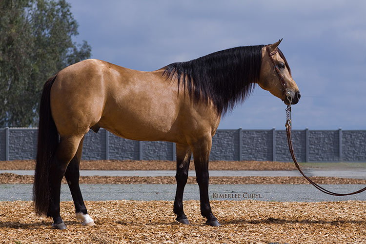
The sideways conformation shot is good for seeing the true conformation box. You need to be completely perpendicular with the horse. I like my eye to be level with the withers. Educated buyers want to see all four legs in the photograph. If you are looking at the left side of the horse and you can’t see the right front leg, it may seem like you are trying to hide something about the horse’s conformation. Make sure that the front and back legs furthest from the camera are brought in slightly and the front and back legs closest to the camera are moved slightly outward (see photo below). This will create a window that allows you to see all four hooves.

Photo by Kimerlee Curyl of AQHA Stallion Shining Lil Nic
3. Lighting
For conformation and sales you want the horse to be facing the light. The best time to photograph is in the morning or evening, not at noon. At noon they will look blown out with black and hollow eyes.
4. Headshot
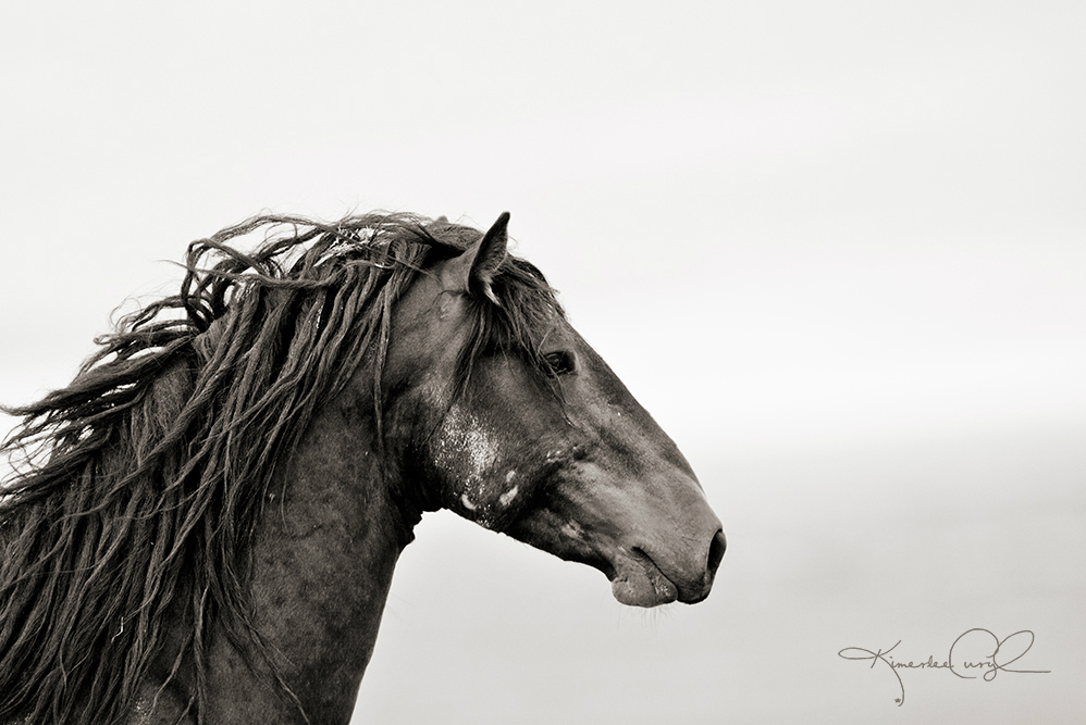
When I do a headshot, I like to show the shoulder. A nice headshot where the horse is looking off at something can really accentuate the shoulder and neck and give animation to horse’s eye, making the animal look more dynamic. Have a friend stand to the side of the horse with something to grab its attention. When the horse looks at that, snap the picture!
5. Don’t pressure them
Think about where your horse is comfortable. You shouldn’t take the picture in an unfamiliar or uncomfortable location. You can’t make them be happy and comfortable if they aren’t. If they are nervous they will be spinning around and you won’t be able to get a good photo.
6. Level Ground
Have the horse on level ground. Also make sure the grass on the ground is not so tall that it covers their hooves. You want the viewer to be able to see all aspects of the horse.
7. Get your hand out of the shot
When people take pictures of horses, they tend to hold the lead rope, constantly fussing with the horse to keep it still, which usually results in their arm/hand being in the shot. If the horse wants to take a few steps forward, let him; when he stops, you can then take the shot. Having your hand in the shot can be distracting and gives the illusion of too much control.
8. Be forthcoming
There is no way you can hide conformation or injury in a picture. It is irritating for a buyer to hear one thing about a horse and then see something different. Put up a true picture of your horse and hope for the best. If someone comes to look at the horse, at least they will have an honest impression of what he or she is.
Kimerlee Critiques…
Recognizing common mistakes.
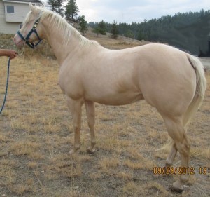
- The ground is not level here. You always want to photograph your horse on level ground.
- Photos are divided into three planes. In this photo the horse’s nose and butt are on different planes, giving the illusion its back is probably longer than it actually is. You need all parts of the horse to be on the same plane, which you can easily accomplish with the side conformation shot.
- The “shooting from the hip” angle can be done in an artistic way, but it is not good for sales photos. It causes the butt to look larger than it actually is, gives no perception of what the face and eye look like, and doesn’t give a clear line from shoulder to pasterns.
- The positioning of the legs here doesn’t allow you to see any of the right back leg, making it look as if they are hiding something on the right hind.
- They could have chosen a better background. The coloring does not compliment the horse because there is no contrast between the horse and ground.

